This is the first post in a series of weekly publications about the US 2022 midterm elections for the House of Representatives. From today until election day on November 8th 2022 I will be developing a predictive model for estimating the likely outcomes of the election. In the aftermath, I will be able to evaluate the precision of the model and reflect on its strengths and weaknesses.
For now, we will visualize the two party vote share from the 2014 midterm elections by state and district. Then we will look at seat shares for the states and compare to our popular vote margins to see the voter distribution effects of districting and gerrymandering on seat outcomes. Lastly we well identify historical swing states so we can get a sense of what states to narrow in on for further modeling.
2014 Trends in Popular Voting:
Lets start with a simple map colored in to represent the results of the 2014 House elections. We will try to get a quick answer to: Which way do states lean in their two party popular votes when aggregating all districts?
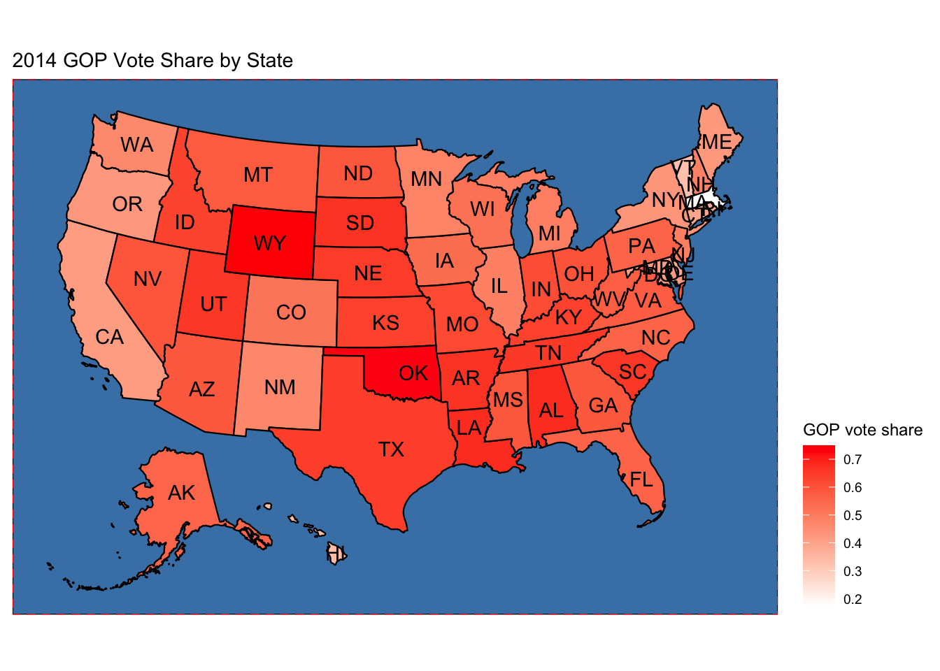
The map above will roughly estimate which seats are locked in for either party. With redistricting happening in the recent 2020 census, popular vote trends have a unique advantage of continuity despite shifting county boundaries.
The overall picture paints strong Republican presence in the central and mountain time zones as well as strong turnout in the South East. States like Wyoming and Oklahoma in bright red indicate overwhelming Republican popular vote majorities. On the other hand, near the coasts in light pink and white are states like Massachusetts and California which have overwhelming Democrat popular vote majorities.
It initially seems that most states in orage are likely harder to predict what outcomes they might have. Looking further into districting though gives more concrete insights into how thie popular vote is distributed to win seats in Congress.
Districting Effects:
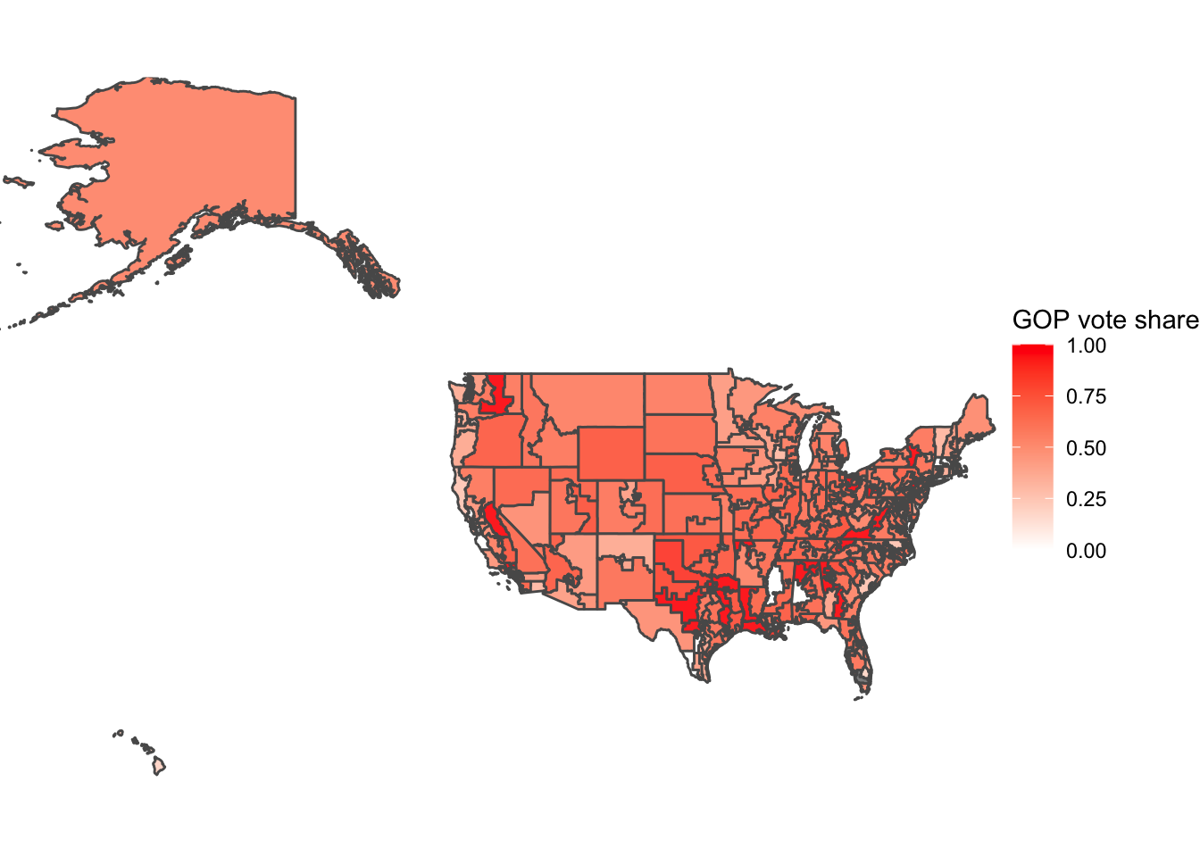
The difference when looking at districts is that area and population density are negatively correlated. The map above shows large swaths of red districts with an occasional pink and white island around urban areas.
Although it seems that republicans have a large advantage in this visualization, do not be misled because the districts on this map are small and the smallest are generally held by Democratic voters and they are worth just the same as the larger red districts.
Lets aggregate these district results to the state level and compare our earlier map of popular vote to seat outcomes.
Seat Shares and Gerrymandering:
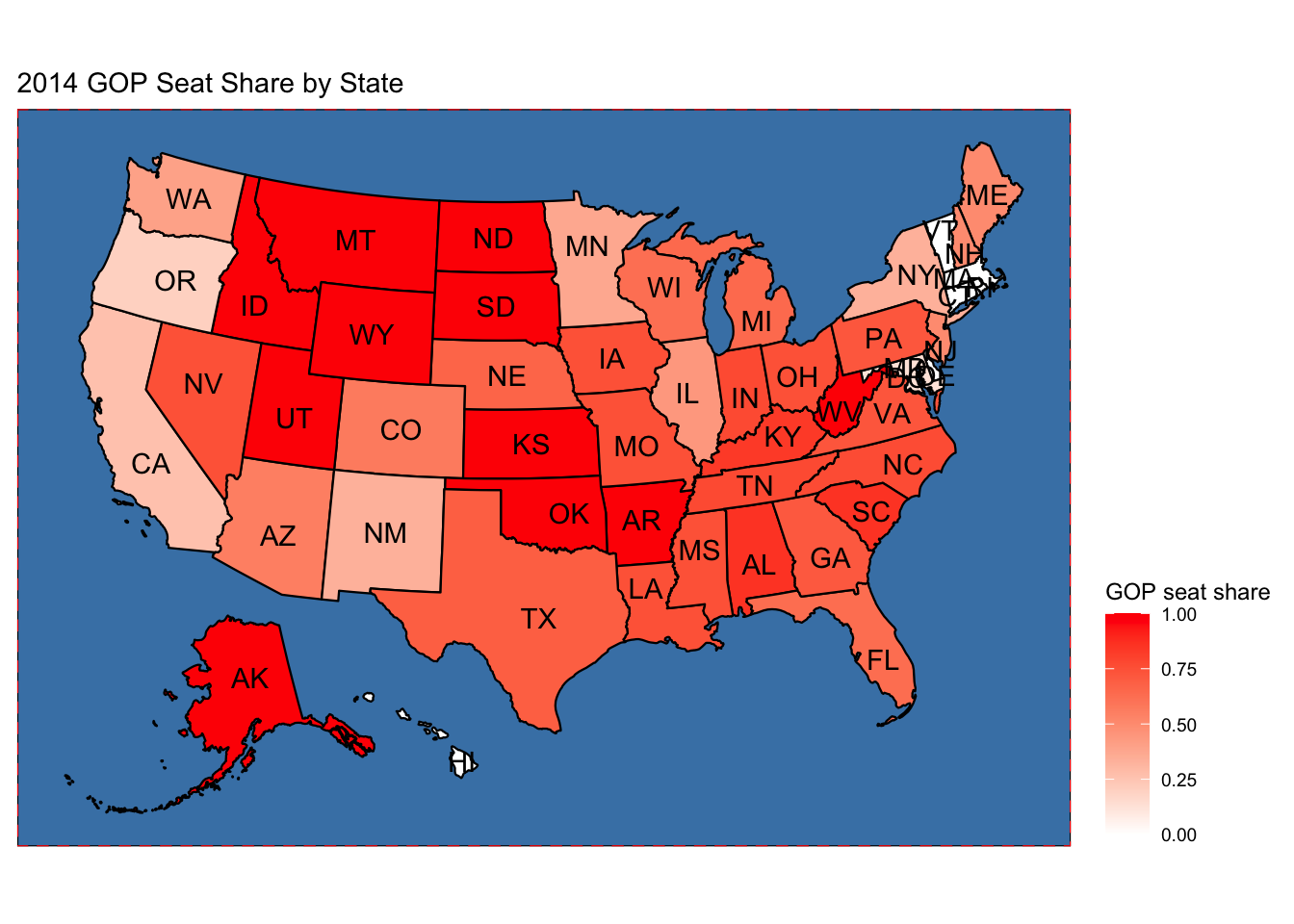
The first thing to note is that wholistically, the popular vote and seat share correlate strongly as one might expect. The two graphs differ in their decisiveness. The feeling given off by this chart is that on the state level, states are more one-sided in their outputs than they are in their inputs. A few examples can be seen in the deeper hue of red in the middle states and bright white on the Pacific West and Northeast.
So why does this descrepancy between democratic outcome and respresentative outcome exist?
It has to do with the efficient distribution of voters within the districts of each state. House elections are winner take all in each district. A candidate might win their seat regardless of how large the minority of voters against them. Districts won by small and large margins affect the two maps compared above differently. The difference becomes visible when one party is biased by distict layout. As a whole, this means that when Democrats are elected, they win by large margins and when they lose they typically lose by small margins. This is what makes the seat share more red than the popular vote share.
The impact of districting is critical to house elections and when incumbents use strategic redistricting to exaggerate its leverage over the popular vote, it is called Gerrymandering. The impact of gerrymandering is hard to predict for the upcoming 2022 elections because it is the first to happen on a newly minted district map. It will therefore be less useful for prediction but will surely impact the election results once votes are tallied.
Identifying Swing States:
To clear the obvious confusion of: What in the world is “Swinginess”? A state’s propensity to be a swing state is taken to mean: How volatile is the two party voting turnout over many election cycles? To measure this, we can use time series data going back to 1968 on congressional elections. The Swinginess formula is: \(R_{x}/(D_{x}+R_{x})-R_{x-2}/(D_{x-2}+R_{x-2})\) Where R and D are total votes for Republican and Democratic candidates respectively and x is the election year. In other words it measures the difference between which direction the state voted in the last election to the next election. Looking across time, Virginia, South Carolina and Florida seem to recently have high volatility in their two party vote shares while a state like California has settled down and not moved significantly recently. Data on swing states is useful for prediction because is will indicate where prediction confidence should be dialed up or down for measuring the overall confidence of a prediction.