Election Analytics Blog

2022 Midterm Election Predictions and Analysis by Charles Onesti

Colrado District 3 Campaign Recap

Having had some time to look at the results and compare with my own prediction and that of other forecasters, this week I will look at a particularly contentious district and investigate what might have led to prediction error. The Colorado 3rd district election was much closer than anticipated and had very interesting campaigns.

District Background

The Colorado third congressional district spans a massive 50,000 miles in western Colorado. The area is largely rural and has a median household income of $64,000. The college education rate is 35% and the median age is 42 years old. Amidst the wide stretches of beautiful landscape, CO-3 has two major cities: Grand Junction and Pueblo. Grand Junction is primarily inhabited by Republican voters, while Pueblo, which has a large Latino population and union labor, has more Democratic voters. The racial demographic of the district is three fourths white and one fourth hispanic/latino. During the 2020 census redistricting, the district shrunk overall losing most of its ground in the northern sections and gaining some ground along the southern border.

Representation for CO-3 has historically been split between both Republicans and Democrats with near perfect alternation until 2011. In recent history, a Democrat has not won since John Salazar was elected in 2004. The seat was then held by Scott Tipton for 10 years and then won by Lauren Boebert in 2020 after she defeated Scott in the Republican primary. Despite several Republican won elections, the vote share for Democrats has been increasing since 2014. The 2022 election was between the incumbent Lauren Boebert and the Democrat challenger Adam Frisch.

538 Forecast and Result

FiveThirtyEight predicted the CO-3 election outcome using a model created by Nate Silver. Silver’s model combines economic variables with polling data and adds in some expert predictions to create a prediction aggregate about the vote share in the district. A probability of winning is put together by taking a vote share distribution and running 40,000 simulations and counting the number that end up with Republican or Democratic majorities. For Colorado 3, they predicted a 97% chance that Boebert would win the election with vote share distribution centered around 57% in favor of the Republican candidate.

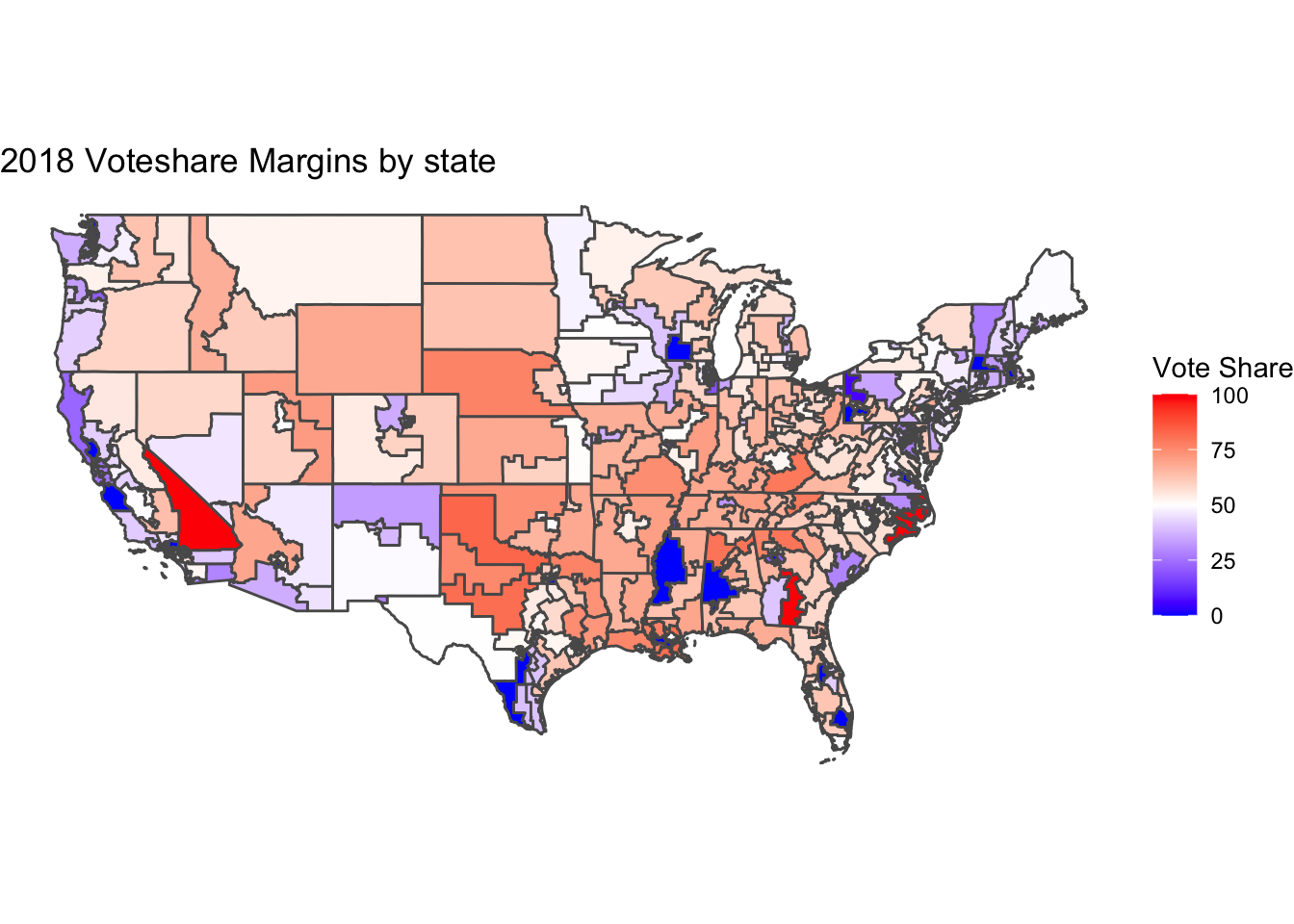
The prediction indicated a margin of 14 points between Boebert and Frisch. The actual result was a much closer race. The current vote tally reports Boebert winning by a margin of 0.2 percentage points.

The Campaigns

Lauren Boebert (R):

  • Strongly conservative
  • Won primary by large margin against Don Coram 63.9% to 36.1%
  • Pro-life
  • Top issues
    • Inflation and Economy
    • Veterans and Defense
    • Getting Things Done
    • Standing up for Local Communities
    • Agriculture

Before running for office, Boebert’s experience included working as a natural gas product technician and owning Shooters Grill. When she announced she was running for re-election, she stated, “We don’t just need to take the House back in 2022, but we need to take the House back with fearless conservatives, strong Republicans, just like me.” Boebert has a traditional conservative stance supporting a small government, constitutional rights, and reducing regulations.

Adam Frisch (D):

  • Democratic moderate. Demonstrates conservative values and feels very Republican
  • Won primary by thin margin against Sol Sandoval 42.4% to 41.9%
  • Pro-choice
  • Top issues:
    • Inflation
    • Jobs
    • Water
    • Energy
    • Veterans

Adam Frisch is a former Aspen City Councilman who describes himself as a “a pro-business, pro-energy, moderate, pragmatic Democrat.” His campaign emphasized that the economy and getting inflation under control were his top priorities. Frisch also campaigned on creating jobs and ensuring a Colorado water supply for future generations.

While Boebert seemed to be more focussed on national politics Frisch was actively appealing to the local politics. The largest discrepancy in their list of issues was the water supply issue which made the top five for Frisch but was the very last issue after 18 other issues on Boebert’s agenda. This might be because Boebert is an incumbent and already embroiled in national disputes and controversy. It is clear from Frisch’s campaign rhetoric that he was attacking Boebert on her “publicity stunts”, “raising money around the country”, and “extremist” beliefs. His attacks are an attempt to undercut her base by appealing to local issues like the water supply.

From a national benchmark, the election was really more like Republican versus Republican. Frisch took his stance as a fiscal conservative with his only Democratic qualities being his one or two under emphasized social views such as being pro choice. Boebert was strongly conservative across the board including social issues. Investigating Frisch’s campaign materials a little more, the strategy of “I’m a democrat but I’m the reasonable conservative” becomes more apparent. His website has more red than blue on it and his merchandise store sells a tee that says “I’m Adam Frisch, I’m not Nancy Pelosi.” Frisch’s conservative campaign is effective because most people in the district identify as Republicans. The Cook Political Report ranks CO-3 as “Solid Republican.” Frisch was trying to get a majority by being the more democratic candidate for the Latino vote and conservative enough to take Republicans away from aligning with a more hard line Candidate like Boebert.

Forecast Error

CO-3 was perhaps difficult to predict because of the unusual campaign that Frisch was running. Any model of historical data would expect the Democratic nominee to align themselves more with liberal ideologies. This is exemplified by how Frisch’s nomination was won only by a slight margin, indicating that it was difficult for a moderate of his type to win a Democratic primary. The decision made in that primary was probably the real unanticipated outcome for the forecasting models which are trained on traditional party candidates.

According to Lynn Vavreck’s campaign theory in “The Message Matters”, since the macroeconomic environment is bad and the incumbent party nationally is the Democratic party, Boebert should be running and insurgent campaign which highlights the economy while Frisch should be running a clarifying campaign which highlights a different issue to distract from the economy. This could not be father from the case in CO-3 however. I think the defining feature is that Frisch reframed Boebert and the Republicans as being the incumbent party and ran much more of an insurgent campaign himself. Boebert on the other hand ran a more clarifying campaign and focussed on social political issues rather than the national economy. The unusual nature of the campaigns made a difference in the ability of FiveThirtyEight to predict the election outcome.

References

Lynn Vavreck. The message matters: the economy and presidential campaigns. Princeton University Press, 2009. Lauren Boebert campaign website: https://boebert.house.gov Adam Frisch campaign website: https://www.adamforcolorado.com Ballotopedia election blog: https://ballotpedia.org/Colorado%27s_3rd_Congressional_District_election,_2022 FiveThirtyEight forecast: https://projects.fivethirtyeight.com/2022-election-forecast/house/

Author image Charles Onesti

09. Reflection

The results are in! After an exciting election period, let’s do some recap on the results and reflect on the predictions I made two weeks ago.

Recap

The congressional elections were a very close call in both the senate and the house. The Democratic candidates performed better than expected and the Republican candidates under performed. The result is that the democrats secured a majority in the Senate with 50 confirmed seats and the presidency while Republicans have 49 confirmed seats. The outstanding seat belongs to Georgia which is going to a runoff election on December 6th. The House of Representatives is now in a Republican majority with a confirmed 220 seats having flipped 18 seats. The democrats have 212 seats only flipping 6 seats from last cycle. Below is a plot of the results (on a slightly outdated map. For better results see https://www.reuters.com/graphics/USA-ELECTION/RESULTS/dwvkdgzdqpm/)

Model Reflection

At a high level, my prediction was biased too strongly in favor of Republican candidates. The overall district level accuracy of my model was 355 correct predictions and 80 incorrect predictions. I am definitely not the only forecaster out there who thought there would be a stronger red wave given the low presidential approval ratings and low economic figures during the term of President Biden. Looking more closely at the details will elucidate what aspects of my model may have lead to this error. My model is actually a series of 435 district models each fitted to its specific historical data. The independent variables in each regression are:

  • Unemployment rate: The economic predictor with the best r-squared for my data. The theoretical motivation is as described in week 2 that unemployment is a democratic party issue and would favor democrat candidates regardless of incumbency.

  • Seat incumbency: Candidates running for re-election have a massive advantage in name recognition and fundraising. This variable captures that advantage as two binary indicators.

  • Presidential party incumbency: Midterm election are often used by voters as a way to reward or punish the performance of the incumbent president.

  • Presidential approval: The presidential party variable and the presidential approval are in the regression as interaction terms so that the theory of reward and punishment can manifest if the trend exists in the data.

  • Expert prediction: To have historical expert prediction to model on, I used the Cook Report district ratings and averaged them with the Inside Politics ratings. Experts often have key insights investigating battleground districts so if they have a history of success their 2022 predictions should shine in my models.

Accuracy Reflection

A visualization of my model results looks like this: 
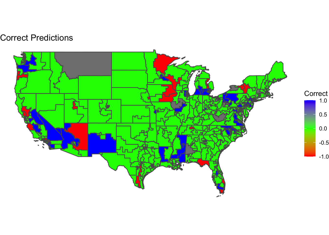
The districts colored in green were correctly characterized by the model while districts in red and blue were incorrect. Red means that the model predicted a Democratic candidate to win but a Republican won instead and blue means that the model predicted a Republican candidate to win but a Democrat won instead.

My models were most often accurate in the Central United States in areas like Texas, Oklahoma, Colorado. This is because these areas are solidly Republican on most years and so the model had a strong history of consistent outcomes to train on. This might also be a result that Republican leaning bias might inadvertently make my predictions seem accurate in states that solidly vote Republican. I also had some good predictions outside the central region in states like Georgia, Alabama and solidly Democrat states in the North East like Massachusetts, New Hampshire, and Maine. On the other hand, contested battleground regions had higher miss rates in my predictions. States like Florida, California, and Arizona had several mispredicted districts.

Looking at the model design, I suspect is that my independent variables of presidential incumbency and approval rating skewed my results against the Democratic party in a way that is no longer a present force in modern elections. I based my choice on the theory taught in academics that presidential approval and seat change for the presidents party are strongly correlated. The mechanism is that people reward or punish the party in midterm elections by judging the performance of the president. The interaction term in my regression between presidential party incumbency and approval rating was not as important as I expected in this election however.

This is possibly due to what Lynn Vavreck called “calcification” or the idea that party identity matters more than something like presidential approval. In other words, voters are no longer holding referenda on the president during midterm elections and are instead so divided on the issues that Republican and Democrat candidates disagree on that their vote is decided by ideological default. This would also explain why economic fundemental variables were unprecedentedly poor predictors of this election outcome. The unemployment variable in my models would then be just as problematic to its predictive accuracy.

Improvement

If I were to approach this task again I would drop the unemployment, presidential incumbency, and presidential approval variables. I would swap in variables that are closer measures of a voter’s sentiment like campaign and candidate quality leading to voter turnout, and stances on ideological issues. Given accurate enough data on these variables would allow for better observation of the newest trends towards partisanship in modern politics where I believe turnout and ideology matter more than fundementals.

Another way to improve prediction is to use the most recent polls which are, for obvious reasons a great way to predict a result because they are by definition a sample of the end result. However I am not in favor of using polls because I don’t think they offer any insights. I would rather choose an independent variable that has a theoretical motivation to be related to a person’s vote rather than just asking them who they are going to vote for because we can therefore learn more about the world and about how democracy works. So, if my model provides a better learning opportunity at the expense of accuracy, I am willing to make concessions.

In contrast to polls, I would be interested in testing out further the ideological voting idea. Using data on a voter’s stance on issues, issue salience/recency, and data about candidates and the campaigns they run, I think a model could more accurately predict an election’s outcome. At the very least, the research would surely further our understanding of what motivates voters in elections.

Author image Charles Onesti

08. Final Prediction

This post contains my final prediction for tomorrow’s midterm elections. This is the culmination of my past 7 posts analyzing different aspects of election prediction and campaign theory.

Model Description and Justification

My model is composed of unique district level models. Each district model is a binomial logistic regression predicting the outcome that a republican candidate wins the election in that state. Creating over 400 district models was very challenging because of the restricted time scope of the data I am working with. I believe that it is still worth it to make this decision because it allows each district to be unique and it is the closest modeling technique to the structure of the actual election. The seat share after voting ends is determined by the aggregate of every individual election and my model will do the same with its predicted outcomes. I chose to use the inverse logistic function for regression because linear predictions with limited data tend to be volatile. A GLM meant that probabilistic predictions would stay in the 0-1 range.

Model Formula

The independent variables in each regression are:

  • Unemployment rate: The economic predictor with the best r-squared for my data. The theoretical motivation is as described in week 2 that unemployment is a democratic party issue and would favor democrat candidates regardless of incumbency.

  • Seat incumbency: Candidates running for re-election have a massive advantage in name recognition and fundraising. This variable captures that advantage as two binary indicators.

  • Presidential party incumbency: Midterm election are often used by voters as a way to reward or punish the performance of the incumbent president.

  • Presidential approval: The presidential party variable and the presidential approval are in the regression as interaction terms so that the theory of reward and punishment can manifest if the trend exists in the data.

  • Expert prediction: To have historical expert prediction to model on, I used the Cook Report district ratings and averaged them with the Inside Politics ratings. Experts often have key insights investigating battleground districts so if they have a history of success their 2022 predictions should shine in my models.

Example Regression Table

## 
## Call:  glm(formula = rep_win ~ unrate + D_inc + R_inc + pres_dem * approval + 
##     pres_rep * approval + code, family = binomial, data = .x)
## 
## Coefficients:
##       (Intercept)             unrate              D_inc              R_inc  
##         2.457e+01          1.109e-09                 NA                 NA  
##          pres_dem           approval           pres_rep               code  
##         9.417e-08         -7.106e-07                 NA          3.960e-08  
## pres_dem:approval  approval:pres_rep  
##                NA                 NA  
## 
## Degrees of Freedom: 4 Total (i.e. Null);  0 Residual
## Null Deviance:       0 
## Residual Deviance: 2.143e-10     AIC: 10

A few things I notice in this table is that the unemployment rate (unrate) has a positive coefficient. I would have expected a negative one since the prediction is probability of Republican victory and unemployment generally favors Democrat candidates. The next peculiarity is that the model decided to ignore the seat incumbency and instead only use presidential party incumbency.

Model validation

The final prediction of the set of district models is 244 Republican seats and 191 Democrat seats. This includes adding in districts that failed to model due to lack of data. Unmodeled districts tend to by no contest races or uncompetitive races to I filled in with the expert prediction average.

I corroborated my Binomial logistic regression results with an equivalently composed linear regression and found that the results were nearly identical. The linear model seemed to favor the Republican majority by only 9 seats (253,182).

I was unable to create a predictive interval for these models because of how I coded a binary outcome. Upper and lower bounds calculated with the standard error were almost identical to the prediction and were either very close to 1 or very close to 0. After wrestling with the data my compromise was to lose visibility on this statistic in order to get modeled predictions on more districts.

Author image Charles Onesti

07. Shocks

Welcome back to the last blog post before I make a final prediction on the 2022 midterm elections. The focus of this week’s post is on voting shocks. A shock is a political or apolitical event that influences a voter’s state of mind. Identifying a potential shock must be followed with some reasoning about how the public responds to that kind of event and then theorize about how which direction voters will move on average between candidates. Useful heuristics to make this theorization easier are incumbency and party ideology heuristics. To judge the valence of a shock we can just consider whether it will make most voters more or less favorable for an incumbent or a party and then adjust our expectations according to those data. Bagues and Volvart (2016) use this approach when talking about how an apolitical shock like winning a lottery will increase the favorability of incumbent candidates. This kind of analysis is replicated by Achen and Bartels (2017) who instead observe that a surge in shark attacks will reduce the favorability of incumbents. The unifying conclusion is that events that make people happy will encourage the average voter to support the incumbent candidate in an upcoming election and negative events will hurt incumbent re-election. While Achen and Bartels see this as an instance of purely irrational voting behavior, emotionally motivated voting is not necessarily misguided depending on the nature of the shock. An effective representative should be able to minimize the odds of negative events and increase the odds of positive events.

Shock: Affirmative Action in the Supreme Court

Looking at the upcoming election, I decided to measure the impact of the Supreme Court rulings on affirmative action for college admissions. I chose this topic because it is similar to the Dobbs case in the sense that it is also a judicial ruling, and because it is related to this very blog which is for a Harvard class. To measure the salience of affirmative action as a shock, I used the NYT article API to create the following weekly frequency graph.

Each week combines the number of articles that mention the keywords affirmative and action. You can tell that in the beginning of the year, the topic had a spike in discussion which has since died does with small peaks every month or so. For midterm election purposes, according to this graph, the topic is not recent or “shocky” enough to have any macro impact on the election outcomes.

Ongoing prediction model

Returning to our running model from previous weeks, I want to take a different approach this week. I have recently been struggling to get powerful predictive results with district level results due to sparse data and rank deficient fits. One way to try and shake things up is to use a pooled model. This means that instead of trying unsuccessfully to make 435 unique models, we can just make one model and run demographics through the model so that predictions still clock on the district level. This will result in districts with similar demographic data having correlated outcomes. Fundementally the assumption in play is that this election will largely be based on voters voting on party lines. Demographics have historically been tightly bound to party afiliation and so the pooled model makes sense to use in this situation.

This weeks model will use. Candidate and presidential party incumbency, recent generic ballot polls, demographic data on race, ethnicity, and sex. The regression table looks like this:

Alas, the model is still not quite right. Its final prediction anticipates that republicans will win 324 seats against 110 for Democrats. This prediction is too heavily skewed in favor of Republican candidates. Perhaps one reason for this is a shortcoming of the pooled model. I can see that all demographic variables have positive coefficients which is not logical given well documented trends that black voters tend to vote for Democratic candidates. Going into my final prediction on Nov. 7th, I plan to address this issue and make qualify uncertainty with a probabilistic model.

References

Christopher H Achen and Larry M Bartels. Democracy for Realists: Why Elections Do Not Produce Responsive Government, volume 4. Princeton University Press, 2017

Author image Charles Onesti

06. Ground Game

In contrast to the Air War described in last weeks post, the ground game constitutes any non-digital voter outreach conducted by political campaigns. This week’s post is firstly about the axes of persuasion and turnout that air war or ground game strategies might impact. Last week we saw how advertisements have only a short lasting effect on voting behavior. Ground game strategies such as canvassing and voter rallies, however, are considered to be more effective at influencing voters. A study by Enos and Fowler finds that ground game activity can increase voter turnout by around 8 percentage points. Using new citizen voting age population data on districts we can test whether ads create a similar influence on voter turnout within their district. After looking at voter turnout, we will try out a first attempt at binomial logistic regression models to predict district level 2022 vote share outcomes using polling data.

Close Elections: Do Ads Predict Turnout?

Do ads keep up with the effectiveness of the ground game at increasing voter turnout? This section plots data from 2006 - 2018 on districts where ads were run. The visualizations show the relationship between the number of ads run in a certain district against the party voter turnout for that election year for Republicans and Democrats.

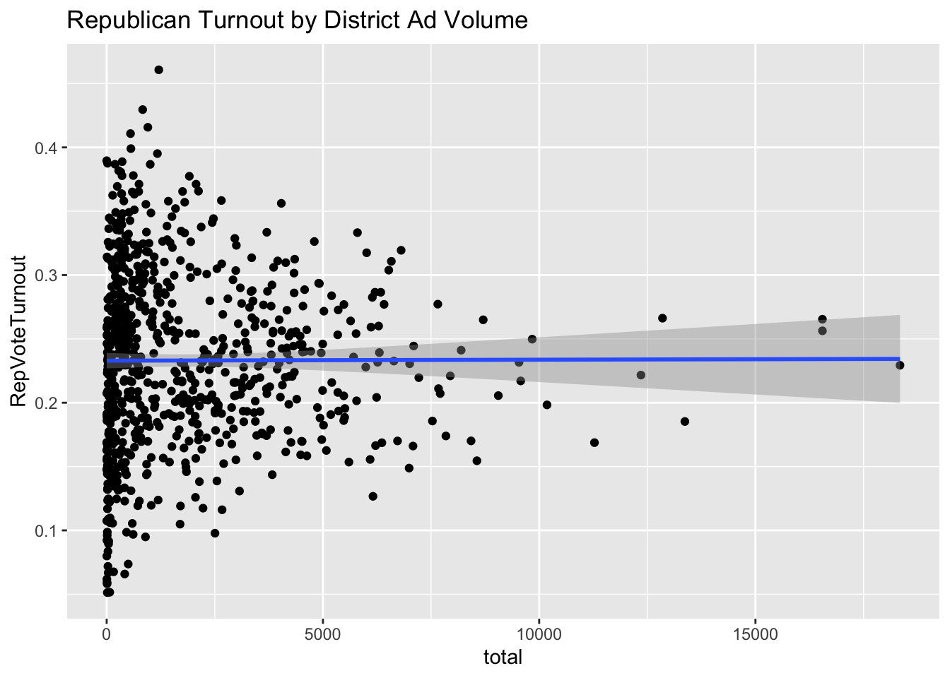
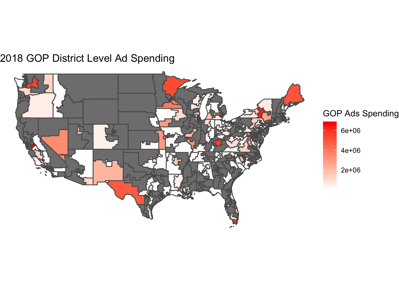
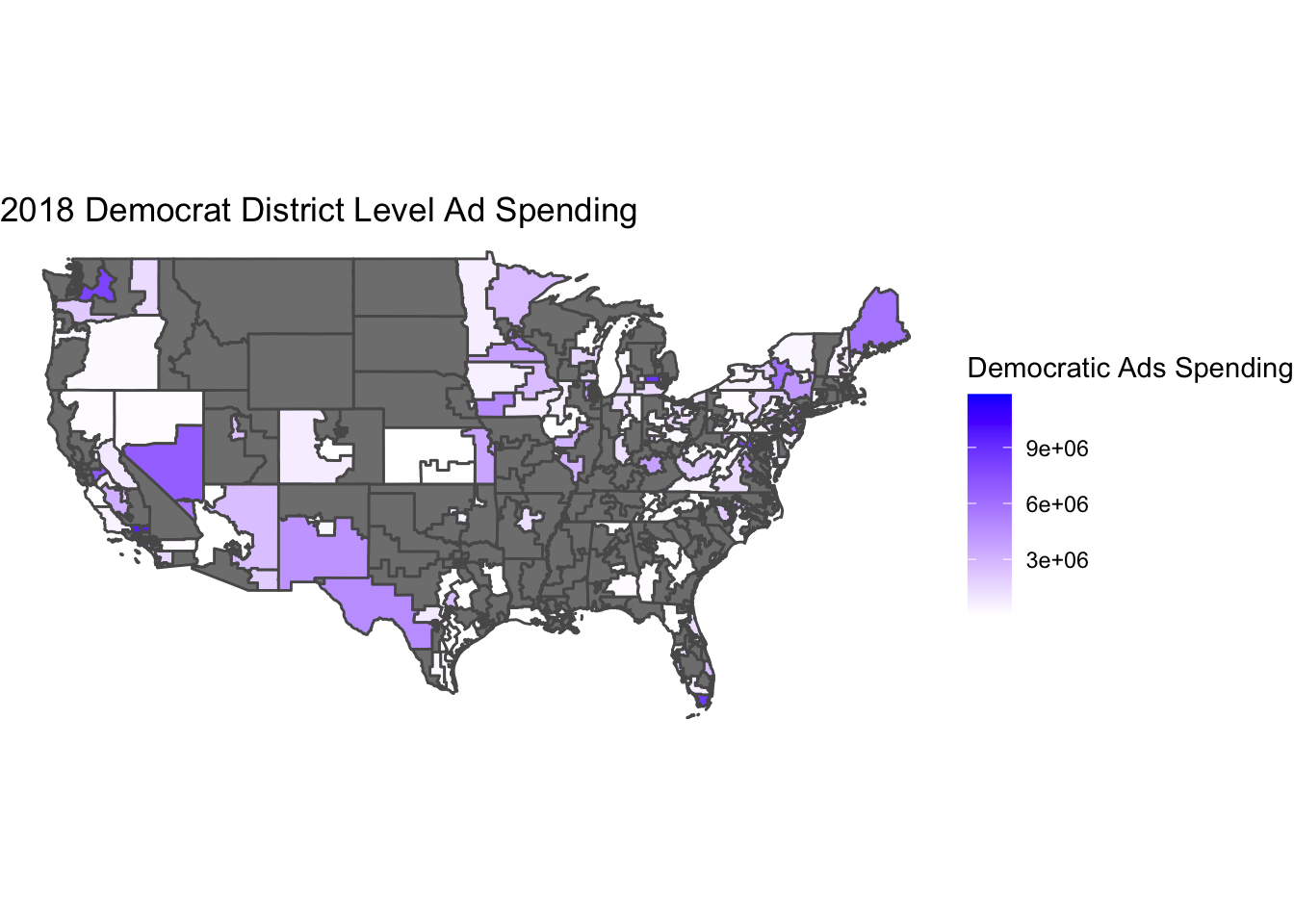
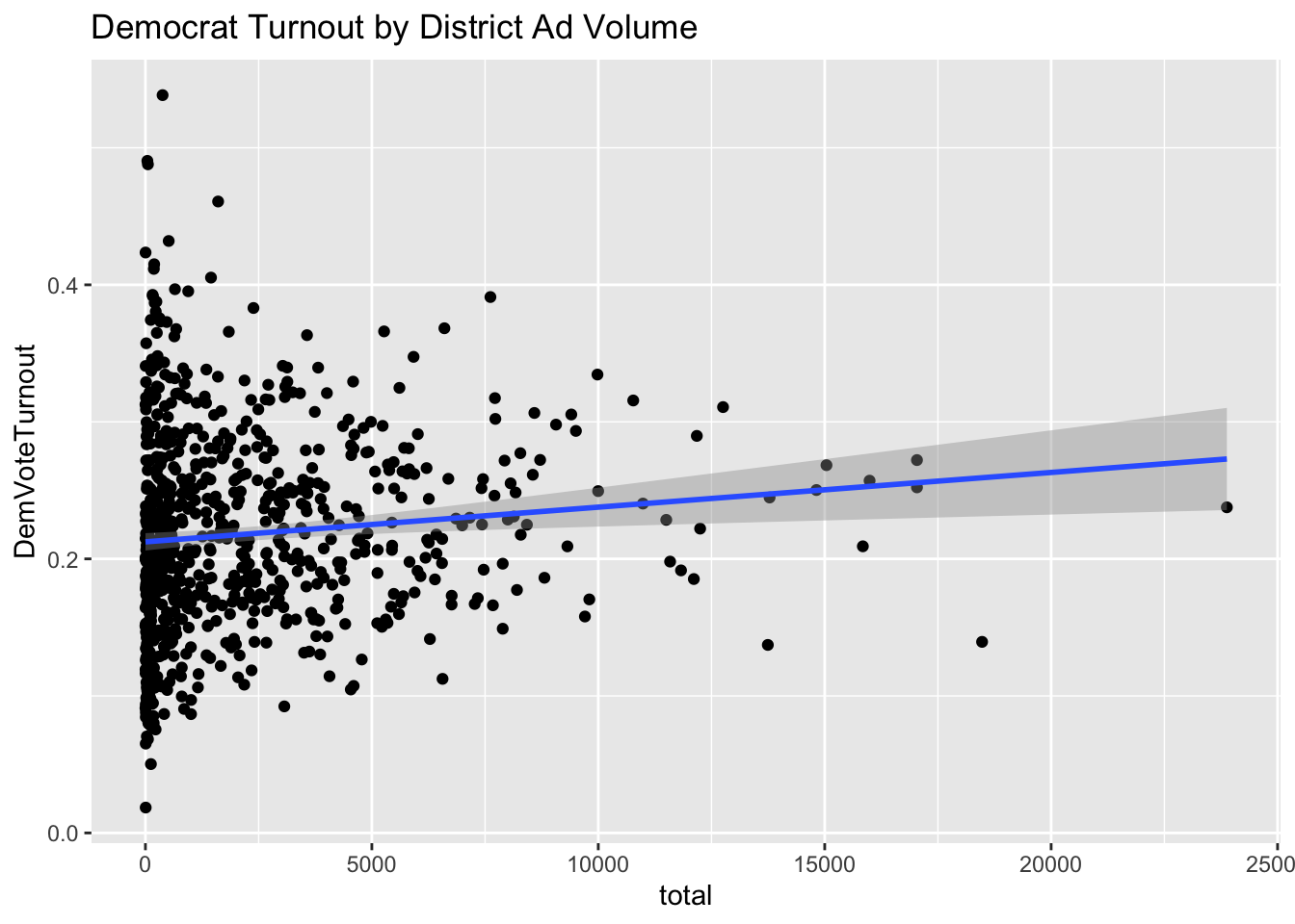
The charts above show a little correlation for Democrat ads and zero for Republican ads. This suggests that ads are largely ineffective at increasing voter turnout for a certain party. It is interesting to see that relative to each other, Democrat campaigns see more success in increasing voter turnout with advertisements.

Probabilistic Poll Models of District-Level Races

Now we will try to create district probabilistic models using past polls. These models use binomial logistic regression to compute the probability that a voting age citizen of a district will vote for the Republican nominee or vote for the Democrat nominee. The benefit of this sort of model is that it will never output out of bounds values less than zero or greater than one hundred because it uses an inverse logit function that approaches 0 in the negative asymptotic and 1 in the positive asymptotic. The data available is too sparse to use in district level models though so only around 25 districts have enough data points to generate a model. Here are the results: This approach is clearly not sufficient to make any sort of analysis. In order to make good predictions there needs to be more overlap in the available data about district populations and polling.

Author image Charles Onesti

05. Air War

This week we will explore how campaign activity matters in congressional elections. So far our predictions have used factors outside of a candidates direct control like the national economy and their party or individual incumbency status. The role of a good campaign can not be overlooked. This post will deal with television advertising conducted by campaigns in what is called the “Air War.” The data studied is from the Wesleyan Media Project which contains data from 2006 - 2018 on campaign ads for House elections. Today’s topics include ad timing, geographic placement, and the insufficiency of the data to make stable 2022 predictions.

Campaign Ads Timing

Distribution of campaign ads is something some voters are intuitively aware of. It is no surprise that campaign ads are run only on election years and concentrate to the days before election day. The chart below graphs the ad frequency spikes before each election day represented by a vertical dotted line.

2018 District Level Ads Spending by Party

According to research from Alan Gerber, campaign advertising has a short term effect of voting behavior. We will test whether this effect is present in the spending data from the Wesleyan Media Project. WMP has detailed datasets on the quantity and qualities of congressional campaign advertisements. This includes an estimated cost variable which we will combine for each district in support of either party. The following maps outline party spending volume over the districts. This behavior is well explained by Alan Gerber’s theory that advertising psychological effects last a limited amount of time. Campaigns aim to have their highest visibility right before a person casts their vote so that the ad’s message is fresh in their mind when making a decision.

Ads Spending Models by District

Using the 2018 data as an input lets use historical data to create district level models of vote share as a function of partisan media spending.

This attempt to model has several flaws that are evident from this map containing the predictions from each of the district models. First is how few districts had enough regularly intervaled data to train a model that was not rank deficient. The predictions were also very volatile because of the deficient underlying data so many predictions did not have reasonable values. The 2018 actual outcomes differed from these predictions substantially. For these reasons, I chose to leave ads data out of this week’s combined model.

Creating a New Combined Model

Despite containing millions of observations, this weeks data on advertising turns out to me much more sparse in its range and predictive power because it does not span a large time range and has small coverage over the districts. There is also a lack of advertising data for the upcoming election so there wouldnt be anything to input for a 2022 prediction anyway. So to wrap up a combined model, the available coefficients are fundamentals, polling, and incumbency.

Using - Percent change in RDI - Reelection coefficients - Presidential party incumbency - District polls Leaving out for lack of 2022 data: - Ad expenses

The data is only sufficient to generate models in states where recent and historical polls have been conducted. Out of the 57 viable models, 33 outcomes anticipated a Republican victory while 24 predicted a Democrat victory.

The result table is as follows:

statedistrictpred
Arkansas267.07
California4943.58
Colorado354.19
Florida1660.61
Florida2746.92
Illinois646.42
Illinois1447.50
Indiana556.76
Iowa348.88
Iowa451.71
Kansas168.15
Kansas296.37
Kansas345.04
Kansas486.56
Kentucky694.78
Maine150.08
Maine249.90
Minnesota151.63
Minnesota247.24
Minnesota7108.35
Missouri260.13
Nebraska259.70
New Hampshire145.66
New Hampshire253.59
New Jersey252.93
New Jersey349.34
New Jersey747.45
New Mexico138.05
New Mexico249.07
New Mexico341.32
New York1146.76
Ohio161.65
Ohio1283.06
Oklahoma166.09
Oklahoma549.30
Pennsylvania185.40
Pennsylvania744.83
Pennsylvania863.78
Pennsylvania1064.14
Pennsylvania1698.35
South Carolina149.31
Texas654.56
Texas747.47
Texas1061.65
Texas1757.89
Texas2153.39
Texas2350.23
Texas3172.09
Utah171.22
Utah276.05
Utah376.11
Utah449.87
Virginia248.88
Virginia548.83
Virginia749.02
Virginia1043.80
Wisconsin159.35

References

  • Alan S Gerber, James G Gimpel, Donald P Green, and Daron R Shaw. How Large and Long- lasting are the Persuasive Effects of Televised Campaign Ads? Results from a Randomized Field Experiment. American Political Science Review, 105(01):135–150, 2011.

  • Gregory A Huber and Kevin Arceneaux. Identifying the Persuasive Effects of Presidential Advertising. American Journal of Political Science, 51(4):957–977, 2007

Author image Charles Onesti

04. Incumbency and Expert Prediction

This week we will be adding an incumbency term to our 2022 House elections prediction model and bringing our predictions into the district level. First however, let’s do an analysis of expert predictions. An expert prediction is when a journalist of political pundit make personal predictions about how certain contentious districts will break in the upcoming election. The person or firm informs their decision with their unique knowledge and expertise about the voters and candidates. The prediction takes the form of a 7 option likert scale from “solid”, “likely”, and “lean” towards one party or the other or “Toss Up” if they think the election is too close to make a verdict. The benefit of expert predictions is that, theoretically, expert predictions are already based on solid data collected and considered by each expert and so they are a very easy shortcut to making our own predictions. The major drawback of expert predictions is that they are also packed with the biases of the expert and often tend to be more opinionated than calculated. In the first part of this post lets examine historical expert predictions and see how accurate they were compared to the election results.

How Expert are the Experts 2018 Edition

The method of testing expert prediction accuracy is to look at the district level and compare the election outcome to the average expert prediction. Up first is a plot of all mainland districts colored in red for higher two party vote share for Republicans, and blue for a higher vote share for Democrats. Districts in white had close elections.

Next up are the expert predictions following a similar structure but with a 7 point scale. In this visualization a 3 is the highest likelihood of Republican victory and a -3 is the highest likelihood of Democrat victory. States in grey lacked a prediction from any of the expert predictions. This is perhaps because every expert believed the outcome was not close enough to merit attention.

Overlaying the two maps and showing the absolute difference between prediction and result yields the following combined graph. In this graph a low value of 0 means perfect accuracy and a high value means low accuracy.

In order to make this comparison I decided to convert the vote share outcomes into a 1-7 scale using a tiered bucket system that focused on a vote share margin or up to 6 percent. I clipped off large margins at 6% because I wanted to have the extremes of expert prediction scores be considered accurate for any margin above 6 percentage points and focus on predictions that lay in the middle in margins of 4 percentage points. We can notice in the graph that most average expert predictions are high accuracy and within 2 percentage points of the outcome on average. Geographically, experts seem to be better at predicting northern districts and worse with southern districts such as the Texas, Florida and Oklahoma examples above.

Incumbency

There are a couple axes of incumbency to explore. First is the idea of reelection and the other is about party affiliation. The motivation behind using incumbency on the individual level is that candidates running for re-election have the advantage of greater visibility in their district. One complication about a simply incumbency variable is presented in research by Adam Brown in the Journal of Experimental Political Science. Brown argues that inherent incumbency does not matter to voters in elections but that other factors that correlate with incumbency such as fundraising and candidate quality do matter. So in this model, think of incumbency as the simplest heuristic for candidate quality and visibility to voters. The model also fators in presidential party incumbency which

The incumbency predictions forecast a large lead 252:183 seats for Republican candidates. The regression coefficients indicate that the negative correlation caused by a Democratic presidential position outweighed the majority of Democrat incumbents. As expected, being a challenger had a negative correlation with voteshare in almost all districts while running for reelection had a positive forecast coefficient. I intend to reintegrate fundamentals back into the district level model in future iterations of this prediction.

References

Adam R. Brown. Voters Don’t Care Much About Incumbency. Journal of Experimental Political Science, 1(2):132–143, 2014.

Author image Charles Onesti

03. Polling

There is no better gold standard for election prediction that a direct and simple poll. If you want to know the outcome of a vote, sample a part of the outcome and extrapolate the microcosmic results to the larger population. Yet polling is subject to lots of errors associated with temporal and psychological factors. Gelman and King highlight these problems in their 1993 paper stating that early polls are unrelated to the eventual outcome of an election. This has to do with poll measuring unformed and uninformed opinions on voter candidate preferences. Most voters are not actively seeking information related to far out elections. According to Gelman and King, voters only express their voting preferences later in campaigns around the time when the election is salient and they are forced to make their actual vote. Predictive polling data is therefore only present in the most recent weeks before election day and polling is therefore much less helpful than anticipated because its fruitful results come too late to be effectively acted upon.

Lets investigate how professional election forecasters Nate Silver and Elliott Morris use polling data to generate their predictions for midterm elections.

Silver (2022)

Representing FiveThirtyEight, Silver’s prediction strategy is multilayered and complex.

  • Aggregate as many polls as possible while adjust each one
    • Likely voter adjustment: Weights a poll based on demographics about whether likely voters tend to be more Democrat or Republican
    • Timeline adjustment: Factors in trends over time to infer current poll results from the change over time of previous results
    • House effect adjustment: The model assumes that polling errors in historical races are correlated with current error and use that to tweak polling results if a certain poll shows consistent bias
  • Use poll from similar districts to infer polling results in districts that are not polled
  • Weight polling outcomes with fundamentals model predictions to create a final prediction.

Morris (2020)

Morris’s Economist article provides much simpler but essentially similar approach to prediction.

  • Daily updates with newest poll data
  • Combined “fundamentals” models that factor in variables like incumbency and partisanship

Across both prediction methods, each strategy incorporates poll and fundamentals in a weighted combo to predict outcomes on the district level. Both strategies then do probabilistic analyses to calculate expected seat share for both parties. And finally, both predictions involve running thousands of simulations with each of their probabilities to map out a normal distribution of outcomes and see in how many simulations each outcome was observed. The strengths of Silver’s model is that in integrates a larger diversity of information sources into its prediction. Morris’s model on the other hand sacrifices additional sources of inference for the strength of greater simplicity. I think that simplicity in a model is also important because it allows a viewer to understand how each variable more directly impacts the outcome. This allows insights to be drawn and acted on. For example, a campaign manager could plan the next campaign steps based on which modeled variables benefit their voting goals. The benefit of simplicity is the same reason its not the best idea to apply machine learning to modeling elections and being none the wiser about why the models predicts a certain outcome. Silver’s model is far from the black box complexity of ML though so on balance I think the FiveThirtyEight model is slightly better than Elliott Morris’s model.

The remaining portion of this post will be to make a combined polling and fundamentals prediction of the 2022 election national seat share outcome.

A CPI Fundamental Model

To start off we can make a CPI based model. The independent variable here is the yearly increase in CPI while the dependent variable is the two party seat share for the incumbent party of each election year. We can visualize past election results and the linear model fitting the trend in the graph below:

## 
## ===============================================
##                         Dependent variable:    
##                     ---------------------------
##                             seat_share         
## -----------------------------------------------
## cpi_change                    -0.004           
##                               (0.005)          
##                                                
## Constant                     0.575***          
##                               (0.019)          
##                                                
## -----------------------------------------------
## Observations                    36             
## R2                             0.025           
## Adjusted R2                   -0.004           
## Residual Std. Error       0.065 (df = 34)      
## F Statistic             0.863 (df = 1; 34)     
## ===============================================
## Note:               *p<0.1; **p<0.05; ***p<0.01

We can notice a weak negative correlation between cpi increase and incumbent party seat share. Here the incumbent party is measured as the party with the plurality of the pre election incumbent representatives.

Polls: Total vs. Recent

The polling model I intend to create tests the theoretical observation that early polls are not effective at election prediction. My methods are to take generic ballot poll averages leading up to elections and see how their prediction of the two party vote seat share lines up with the true House election results from that year. The total polls version averages all polls taken up to a year before the election date and the recent polls version of the model only looks at polls within the last 30 days of the election date. I fit a linear model to each dataset and plot the results below:

Total Polling Model

## 
## ===============================================
##                         Dependent variable:    
##                     ---------------------------
##                             seat_share         
## -----------------------------------------------
## dem_pct                      1.035***          
##                               (0.153)          
##                                                
## Constant                      -0.015           
##                               (0.085)          
##                                                
## -----------------------------------------------
## Observations                    37             
## R2                             0.567           
## Adjusted R2                    0.555           
## Residual Std. Error       0.047 (df = 35)      
## F Statistic           45.853*** (df = 1; 35)   
## ===============================================
## Note:               *p<0.1; **p<0.05; ***p<0.01

Recent Polling Model

## 
## ===============================================
##                         Dependent variable:    
##                     ---------------------------
##                             seat_share         
## -----------------------------------------------
## dem_pct                      1.180***          
##                               (0.176)          
##                                                
## Constant                      -0.087           
##                               (0.096)          
##                                                
## -----------------------------------------------
## Observations                    36             
## R2                             0.570           
## Adjusted R2                    0.557           
## Residual Std. Error       0.047 (df = 34)      
## F Statistic           44.999*** (df = 1; 34)   
## ===============================================
## Note:               *p<0.1; **p<0.05; ***p<0.01

Within this dataset it seems that the recent and total models map very closely to one another. They show similar slopes of 1.035 and 1.180 increase in Democratic seat share percentage for ever 1 percent increase in the generic ballot average for the Democratic party. They have nearly identical fit statistics and residual standard error. Next lets apply these historical polling models on current polls for the upcoming 2022 election.

2022 Polls

For reference, here are the polling average differences for 2022 generic ballot polls for total and recent time frames:

Lets use these democrat vote share averages in our model to predict seat share in 2022. For simplicity let’s only use the recent polling data model since it shows marginally better fit than the total one.

## [1] "Total 2-Party Average: "
##         1 
## 0.5086297
## [1] "Recent 2-Party Average: "
##         1 
## 0.5006205
##         1 
## 0.5018243

What a close call! Despite the lower recent polling average for Democrats, the model still predicts a close call with either the total and recent polling averages. Giving preference to the recent data, and combining with the CPI prediction model on 2022 CPI levels at equal weighting, the final prediction of the polling model is a nearly perfect 50% split in house seats: 218 Democrat seats and 217 Republican seats.

References

Andrew Gelman and Gary King. Why are American presidential election campaign polls so variable when votes are so predictable? British Journal of Political Science, 23(4): 409–451, 1993

G. Elliott Morris. How The Economist presidential forecast works, 2020a

Nate Silver. How FiveThirtyEight’s House, Senate And Governor Models Work, 2022

Author image Charles Onesti

02. Local and National Economy

Welcome back to my election analytics blog. This week we will be looking at economic data as predictors for the popular vote. Political science theory described by Achen and Bartels in Democracy for Realists suggests that voter behavior can be modeled retrospectively. When a voter chooses who to vote for, they measure the performance of the incumbent party based on their experiences during the last term when they decide to keep or replace the party candidate. A large factor influencing the experiences of a voter is their economic prosperity. When a voter benefits from increases in purchasing power during the term of some representative, they are very likely to keep that party in power. Likewise, economic deterioration is likely to see the incumbent punished and voted out.
This blog will focus in on local economic data because it is my hypothesis that if retrospective voting behavior surrounding the economy will influence the 2022 elections, a voter’s local economic condition will be more salient an issue to them than national averages. The national and local data is collected from past midterm elections and quarterly unemployment reports from the Bureau of Labor Statistics. We will compare the predictive power of national and local data using models created on historical unemployment data.

The National Model

Let’s begin by looking at national averages of unemployment and midterm two-party vote share for midterm election years going back to 1978. For example, here is a peek into the underlying data table at play:

##  year RepVotes DemVotes RepVoteMargin unemployment_rate
##  1978 24891165 29517656         0.457              6.23
##  1982 27796580 35516107         0.439              9.23
##  1986 26599585 32625513         0.449              6.93
##  1990 28026690 32942345         0.460              5.43
##  1994 37099921 32122004         0.536              6.37
##  1998 32254557 31465334         0.506              4.47
##  2002 37405702 33811240         0.525              5.80
##  2006 35944748 42278903         0.460              4.70
##  2010 43288427 37663261         0.535              9.70
##  2014 39850411 35469234         0.529              6.33
##  2018 51017329 60576466         0.457              3.97

Putting this data into a graph we get the following plot:

A point on this plot represents one row of the data table above. The red dotted line represents the equal vote share level while the blue solid line attempts to fit the trend of the data. Evidently, with so few points and such high variability, the model does not have strong predictive power. It has an R squared value of 0.015. Nonetheless, extrapolating the republican vote share for a current national unemployment rate of 3.8% yields a Republican popular vote share of 0.48 or 48%.

The Local Model

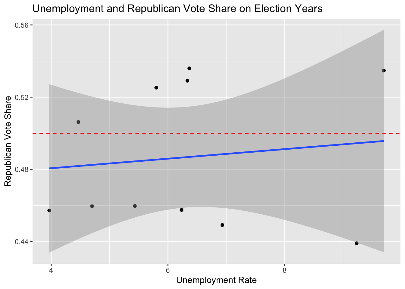
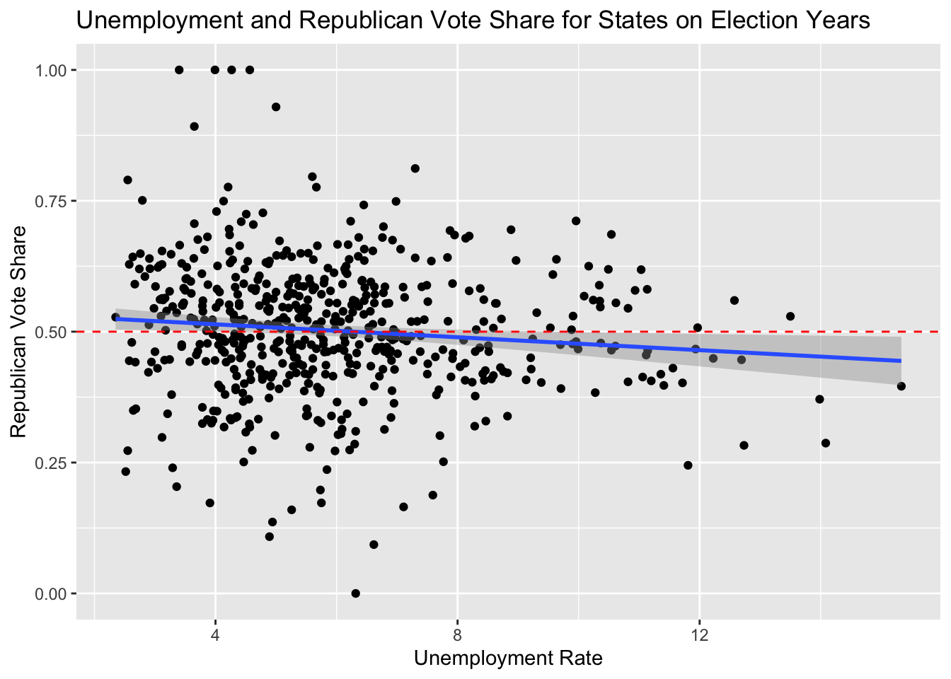
This chart gives a rough visualization of all data points from 1978 to 2018 for all midterm election years combined. Each dot represents data from one state on a certain election year. The midline of 50 percent vote share is marked in red. A result above the line means that the state’s districts were likely won by the Republican candidate and a result below the line similarly favors the Democratic candidate. The linear trend that the data follows is that on average, low unemployment on election years (2-6%) favors the Republican party and higher unemployment favors the platform of the Democratic Party (6+%).

To make a predictive model from this, we will differentiate between states and weight by their population. We use state specific unemployment data on each election years to fit a line for each state. We can then take that state’s current unemployment rate to calculate the predicted 2022 Republican vote share in that state. To weight the values by population, we multiply each prediction by the current state population and divide by the national population. The sum of the remaining predictions is the new population adjusted national republican popular vote share. Following this procedure, the model predicts that Republicans will receive 49% of the popular vote. This is a difference of only 1 percentage point from the simple national model prediction. The R squared values for each state prediction though was on average 9 times greater than the national model but still a relatively small value of 0.092. I expect, however, that with more election cycles to use as data, the predictive power would increase.

According to retrospective voting, this model predicts that economic performance as measured by current unemployment rates gives a small advantage to the Democratic party in national popular vote. The effect is very small though which fits with the analysis of John Wright in 2012. According to Wright, when Democrats are incumbents, they are not punished nor rewarded by decreasing or increasing unemployment levels as much as Republican incumbents. Since the Democratic party is the majority of incumbent candidates this election, I would not be surprised for this result to remain true according to this blog’s analysis.

References

Christopher H Achen and Larry M Bartels. Democracy for Realists: Why Elections Do Not Produce Responsive Government, volume 4. Princeton University Press, 2017.

John R Wright. Unemployment and the democratic electoral advantage. American Political Science Review, 106(4):685–702, 2012. ISSN 0003-0554.

Author image Charles Onesti

01. Introduction

This is the first post in a series of weekly publications about the US 2022 midterm elections for the House of Representatives. From today until election day on November 8th 2022 I will be developing a predictive model for estimating the likely outcomes of the election. In the aftermath, I will be able to evaluate the precision of the model and reflect on its strengths and weaknesses.

For now, we will visualize the two party vote share from the 2014 midterm elections by state and district. Then we will look at seat shares for the states and compare to our popular vote margins to see the voter distribution effects of districting and gerrymandering on seat outcomes. Lastly we well identify historical swing states so we can get a sense of what states to narrow in on for further modeling.

Districting Effects:

The difference when looking at districts is that area and population density are negatively correlated. The map above shows large swaths of red districts with an occasional pink and white island around urban areas.
Although it seems that republicans have a large advantage in this visualization, do not be misled because the districts on this map are small and the smallest are generally held by Democratic voters and they are worth just the same as the larger red districts.
Lets aggregate these district results to the state level and compare our earlier map of popular vote to seat outcomes.

Seat Shares and Gerrymandering:

The first thing to note is that wholistically, the popular vote and seat share correlate strongly as one might expect. The two graphs differ in their decisiveness. The feeling given off by this chart is that on the state level, states are more one-sided in their outputs than they are in their inputs. A few examples can be seen in the deeper hue of red in the middle states and bright white on the Pacific West and Northeast.
So why does this descrepancy between democratic outcome and respresentative outcome exist?
It has to do with the efficient distribution of voters within the districts of each state. House elections are winner take all in each district. A candidate might win their seat regardless of how large the minority of voters against them. Districts won by small and large margins affect the two maps compared above differently. The difference becomes visible when one party is biased by distict layout. As a whole, this means that when Democrats are elected, they win by large margins and when they lose they typically lose by small margins. This is what makes the seat share more red than the popular vote share.
The impact of districting is critical to house elections and when incumbents use strategic redistricting to exaggerate its leverage over the popular vote, it is called Gerrymandering. The impact of gerrymandering is hard to predict for the upcoming 2022 elections because it is the first to happen on a newly minted district map. It will therefore be less useful for prediction but will surely impact the election results once votes are tallied.

Identifying Swing States:

To clear the obvious confusion of: What in the world is “Swinginess”? A state’s propensity to be a swing state is taken to mean: How volatile is the two party voting turnout over many election cycles? To measure this, we can use time series data going back to 1968 on congressional elections. The Swinginess formula is: \(R_{x}/(D_{x}+R_{x})-R_{x-2}/(D_{x-2}+R_{x-2})\) Where R and D are total votes for Republican and Democratic candidates respectively and x is the election year. In other words it measures the difference between which direction the state voted in the last election to the next election. Looking across time, Virginia, South Carolina and Florida seem to recently have high volatility in their two party vote shares while a state like California has settled down and not moved significantly recently. Data on swing states is useful for prediction because is will indicate where prediction confidence should be dialed up or down for measuring the overall confidence of a prediction.

Author image Charles Onesti